Wednesday, July 15, 2009

Compassion

Although all my final paintings for this project were effectively finished I still felt that one of them, "Compassion", could be interpreted better.

Co-incidently I recieved a letter from the OCA advising me of a change of requirements to submissions for assessment. Basically they were asking for all paintings to be presented flat, mounted on black or white card and held in an A1 portfolio. Initially this seemed to cause me a major problem since all my work has been done on hardboard panels. However, they do allow for students already engaged in this course to continue as they have been. Phew!

I had a choice whether to continue as I have been, or change to the new guidelines. It set my mind thinking: I like painting on hardboard panels because they give resistance to the brush or palette knife but, even when primed, they are a bit smooth initially for applying heavier impasto layers of paint. And they are fairly heavy for posting! I decided I should trial painting on sheet canvas pinned tightly to a supporting board which would give me both the resistance and some texture.

Returning first of all to my sketchpad I made yet another sketch study with colours that suggested compassion to me: soft greens, yellows, and blue, with a touch of gold/orange as well:

"Compassion Pastel Study", A5.

Then, with the already primed canvas pinned to the board I marked out my painting size (leaving some space all around for stretching if I so choose at a later date) and then masked it off with drafting tape to create a sharp edge if I decided to present it that way. Finally for this first stage I gave it a liberal acrylic undercoat of strong blue:

"Compassion: Stage 1", Oils on primed hardboard, 61x40.5cm.
With the undercoat dry I started with some tentative marks based on my pastel study.

Then with bold layers of impasto oils I blocked in my main shapes using palette knife technique pushing and pulling the paint around to satisfy some internal prompting:

"Compassion: Stage 2", Oils on primed hardboard, 61x40.5cm.

Finally, trimming around to show the final image:

"Compassion: Final", Oils on primed hardboard, 61x40.5cm.
This will be what is sent for assessment with the canvas sheet pasted to a board and perhaps with a mounting board matt.

That definitely is the end to this project and to my mind one of the most satisfying pieces of work I have done: the colours are good and the painting technique pleasurable and suited to my personality. I will now use this way of painting for all my future paintings in Project 5.

Onward and upward!

Tuesday, July 14, 2009

More Facial Feelings

This set all came in a rush, one after the other. It was as though all the previous work that had gone into this - pastel studies, collages, acrylic painting studies - had built up a head of steam and needed to burst out in free expression.

I was eager to get back out into my studio to carry on from where I left off the day before and so I started with this dark painting:

"Facial Feelings #3", Oils on primed hardboard, 61x40.5cm.
Not the actual mood I was in but imagined and felt. Dark greens, mauves and acidic yellow representing "Envy" or "Jealousy". A dark brooding cloud descends over the brow; cheeks are flushed green, with yellow all the way down to the gut contrasted with purple to heighten the effect and intensify this most negative of feelings. Here I was trying to make the face part of, and arising out of, the background by blurring the edges.

Very uncomfortable for me. I needed to lighten the mood before I sank into this dark horror myself!
With peaceful thoughts I now try to engender a calm "Serenity" with neutral soft greys, pale yellows, and light spiritual blues:


"Facial Feelings #4", Oils on primed hardboard, 61x40.5cm.
I was hoping, of course, to to create these peaceful feelings purely through the chosen colours but with definite facial features arising out of the paint I can't deny it and therefore allow it to happen.

Another change of mood now, not too dissimilar from the soft colours of "Serenity", but deeper to suggest the negative feeling of "Anxiety":

"Facial Feelings #5", Oils on primed hardboard, 61x40.5cm.
Black/dark background, blues, yellows, mauves, greens, and greys flitting across what has become a very definite 'face'. When I showed this painting to a friend she immediately declared that she couldn't look at it, it was too horrible for her. I, of course, was very pleased to get such an intense reaction!

But what about the King of Strong Emotion - "Anger"?:

"Facial Feelings #6", Oils on primed hardboard, 61x40.5cm.
This one definitely took on a new life of it's own. It started very similar to the original pastel study but as I painted new ideas began to emerge. I tried to be open to these new directions and simply followed where they led. This painting, in certain ways, has become less facial although there are various ways of looking at it as a face and a head. That's for you to determine, but I like the ambiguity. What I hope is not ambiguous is the feeling of anger - a hot head in confused and agitated mental state; a red mist descending; the blood rushing up from the lower and bursting out of the top of the head; a black background enveloping around.

Final painting to express "Fear":

"Facial Feelings #7", Oils on primed hardboard, 61x40.5cm.
The blood has drained from the face and there is a dark pit right down to the stomach!

This was at the end of the day the most fantastic painting session I think I had ever had. I was totally exhausted having worked from early morning right through till night but when the juices are flowing you just have to keep going. It's not as though I was having to start from scratch with each painting since most of the hard work had already been done with each of the pastel studies.

I am very satisfied with what I have achieved here and look forward to carrying this experience on to Project 5.

Monday, July 13, 2009

Facial Feelings #1 and #2

And now to the 'end-game'.

While I was extremely pleased with the previous series of five "Free Emotions" painted in acrylics I felt that there was still yet another step to take. I wanted to go further. I wanted this project to end with a series of paintings which would bridge the gap between Project 3: Abstract Painting, and Project 5: Semi-abstract Figurative Painting. And I was still attracted to the idea of using figure elements, ie; faces, to express those emotions.

Some of the pastel studies I made were tantalising - they looked like they could be translated into paintings which would complete the project in the way I wanted.

Choosing one of the studies which was intended to represent "Happiness", or "Joy", and using oils, which I think I prefer to acrylics, I started with this first "Facial Feeling" painting:

"Facial Feeing #1", oils on primed hardboard, 61x40.5cm.
Started laying-in blocks of colour which roughly corresponds with the pastel study, but then, of course, the painting takes on a life of it's own. Allowing myself to feel 'happy feelings' with thoughts of past pleasurable experiences and occassions I paint freely and totally immersed in the painting. I am also trying not to be too descriptive, or prescriptive, of what a face actually looks like preferring to let the emotion come through by the use of colour. Facial features cannot be suppressed for too long and these are suggested with a horizontal stroke here and a vertical stroke there, and the curving side of a cheekbone.

Pleased with this, and somewhat excited, but having taken Number #1 about as far as I can at this moment I decide to make another attempt just to see if I was able to do it all again:

"Facial Feeing #2", oils on primed hardboard, 61x40.5cm.
This one was intended to suggest "Compassion" but it doesn't quite do that for me. I will make another attempt later, but for now these two paintings are a bit of a revelation - I think I may be onto something.

Tuesday, June 30, 2009

Free Emotions

This where it starts to get serious.

After all my experimentation and dozens of studies my perseverance begins to pay off. It’s as though I have taken all that work into myself and now it is time for it to re-surface.
The previous painting was like a quiet starter to get the juices flowing and the hand moving. The middle ground is there waiting for me and I dive right in with this series of "free" abstracts:

Free Emotion #1, acrylics on paper, 61x45cm.
Vertical strokes of pure colour counterbalanced by horizontals. Lively and bright, happy and sunny.

A change of mood:

Free Emotion #2, acrylics on paper, 61x45cm.
Dark, foreboding, anxious, irritable, sad.

On a roll now:

Free Emotion #3, acrylics on paper, 61x45cm.
A mixture of cool blues and scarlet reds suggesting to me 'embarassment' - a flushed face (yes that's what I see!), and a cold sweat.

Another change of mood:

Free Emotion #4, acrylics on paper, 61x45cm.
I always love yellows combined with greys and blues, they appear to me to be very calm, serene even.
But what is this? Is that yet another face I see?
I am definitely beginning to see subliminal faces, not intentionally, but as Harry Nilsson sang, "You see what you wanna see, and hear what you wanna hear" [from "The Point"].

I can see I am going to have to give in to this directional prodding I am getting and start painting faces again!

Final painting in this series:

Free Emotion #5, acrylics on paper, 61x45cm.
This one took the longest and is much more multi-coloured. Perhaps mixed-emotions? This is my favourite of them all, and sure enough there is a face looking back at me. It's a jolly clowns face, but as is the way with clowns, there is also a sadness. Is that a tear I see?
I will call this painting "Tears of a Clown".

With the completion of this series I felt that I had achieved my aim and that these could stand for this project.

But I still wasn't finished yet. There is yet more to come. Tomorrow.

Automatic Emotion

While there was great energy in the work I posted yesterday I felt as though it was too uncontrolled and haphazard, and in any case, far too Joan Mitchell. I love Joan's painting but she has been there before me and I need to find my own means of expressing these elusive feelings.

A new day, a fresh start.

With a calm mind and a clean sheet of paper I draw a series of free lines "automatically" which wander around the page creating a 'diagram' of how I am at that moment in time - quiet, open to suggestion, determined. Choosing generally sombre colours I paint the shapes intuitively:

Automatic Emotion, acrylics on paper, 59x42cm.

I was very pleased with this at the time, however, for me it is too much like "painting-by-numbers" and also it reminds me of paintings by Serge Poliakov or Kasamir Malevich. Again not such a bad thing but this is not how I want to paint. There has to be a middle ground between this highly formal and considered manner and the wild exuberances of the previous "free" paintings.

And that is where I go next.

Oh, yes, and I know you'll think me mad, but you can see this painting as facial can't you?

Monday, June 29, 2009

Finger Emotion Studies

Time to get down and dirty!

Wanting to create a greater connection between what I am feeling and the paper I am painting on I thought by using my fingers to apply the paint might be the way:

Finger Feelings #1, Gouache on paper, 42x59cm.
I have never tried to paint this way in a very long time. Not since my mother said "Take that paintbrush oot o' yer mooth and eat yer Rusks"!
Lots of fun, but very messy. I used gouache because I thought it would be less harmful to my delicate skin :o)
The intention was to paint negative, say anxiety or depression. Could be.

Something more positive:

Finger Feelings #2, Gouache on paper, 42x59cm.
I don't think the yellow is clean enough to represent something happy. And it's far too agitated without being light-hearted.

Worth a try, but not what I am looking for.

Sunday, June 28, 2009

Painting Studies 1

I can assure you all these studies are leading somewhere, just not in a straight line!

After the previous pastel studies it was time to return to painting only this time to a larger scale:

Acrylics Feeling #1, acrylics on paper, 590x420cm.
The intention was negative feeling, but still difficult to actually put a name to it.
As I painted this in a "free" abstract manner, direct from my subconscious, it struck me just how much it resembled paintings by Joan Mitchell. Now that can't be bad, so I continued in a similar vein:

Acrylics Feeling #3, acrylics on paper, 590x420cm.
Trying to be happier with jollier colouring.


Acrylics Feeling #4, acrylics on paper, 590x420cm.
Definitely negative feeling, intended to be 'despair'.


Acrylics Feeling #5, acrylics on paper, 590x420cm.
And then back to being jolly. No wonder I'm confused - it's like a roller-coaster of emotion, one minute high then the next minute deep in depression! Just as well I'm only acting out these feelings and not actually suffering from them. Otherwise I would be getting carted away a jibbering wreck!

Acrylics Feeling #6, acrylics on paper, 590x420cm.
Finally, feelings of love: flushed with reds and pinks with royal blue.

And can you see it?
To me there are semblances of faces rising from the interlacing mesh of these last two.

That's enough for one day, more to follow tomorrow.

Pastel Studies 2

You have at least got to credit me with perseverance. Like a dog with a bone I will never give up if I think there is something more just around the corner!

The day after my lounging around in the garden I returned to my studio for another session with these pastel studies:

Pastel Study #1, pastels on paper, A4.
The intention here was not to try so hard as yesterday but with a lighter touch to draw "automatically" with softer colours that hopefully speak of gentler feelings.


Pastel Study #4, pastels on paper, A4.
Enjoying the shapes that arise but as yet still not speaking of any particular emotion that I can name.

But hard work always pays off in the end:

Pastel Study #10, pastels on paper, A4.
This study generated something I would come back to later, for in it I see a face! And that face appears to be having negative feelings.

These next two studies did not take me forward with that facial idea but I include them here as studies worthy of future abstract paintings:


Pastel Study #11, pastels on paper, A4.


Pastel Study #12, pastels on paper, A4.

Pastel Study #10 put down a marker in my mind. I wouldn't/couldn't yet respond fully to it, but I later saw it as a definite influence in what would follow.

Pastel Studies 1

On a very sunny day at the beginning of June I spent a whole day sitting in my garden, sometimes sunning myself, and sometimes sitting in the shade. But not just lounging about - working as well!

With my painting studies turning decidedly facial, I stopped. I didn't want to get too figurative so early and wanted to explore how to express my feelings only using colour.

So I sat for most of that beautiful day with sketchbook on my knees and pastels in my hand in a meditative state searching within. I thought that by taking the time to quieten my mind and bring all my attention to bear I would eventually feel something.
I can't say that I did especially, but I did make over twenty different studies, five of which are shown here:

Pastel Feeling #1, pastels on paper, A4.
Thinking about what shapes feelings might take. Perhaps that was the problem...thinking!


Pastel Feeling #4, pastels on paper, A4.
Allowing myself to feel lovingly, this one danced around in pink and red. But what is that black shape intruding from the left? All is not well on the love-boat!

Pastel Feeling #7, pastels on paper, A4.
When I think of "Compassion" I always immediately think of a soft green, followed by warmth flooding down. Touches of blue seem to speak of spiritual matters.


Pastel Feeling #21, pastels on paper, A4.
Anger to me is like a red mist descending with hot blood flushing the face and a black knot in my stomach.


Pastel Feeling #22, pastels on paper, A4.
Anger again, this time explosive!

A lovely day in the garden, but none of these studies satisfied me. I needed to try again.

Saturday, June 27, 2009

Project 4: Feelings & Emotions

My apologies to those of you who are following this blog for not posting anything for the last 5-and-a-half weeks (has it actually been as long as that?) I have been unable to find the words for something I have been deeply engaged in and trying to make sense of myself.

A reminder of my intentions:
The Course itself is leading towards a painting style I already have in my mind - figurative painting done in a semi-abstract manner - and Project 2 started with a reprise of fairly straightforward expressive figure paintings (Project 1 being designing this Course for myself); Project 3 took me away into the outer reaches of painting "pure" or "free" abstracts, although at it's culmination I couldn't stop myself from bringing in figurative refrences in my "Scherzo"; this Project No.4 was intended to not only continue with abstract painting but to narrow the field down to exploring specifically how to express emotions visually in colour.

Background:
When I look at the work of some abstract painters I am moved by their work and fascinated as to where their images come from. In discussion with them over the internet they describe to me how their images arise by simply letting go and allowing their own feelings to surface and in so doing give visual expression. I do not know how to do this, and I wish I could!
So, unless I try this for myself I will never know if it is possible for me - always one for a challenge!

What follows is a description of the journey I have taken, and it will need to be fast because I am going on holiday in exactly one week's time to lie on a Majorcan beach till I am as brown as a berry!

With only the vaguest notion as to what on earth I was doing I spent over two weeks at the beginning of this project carrying out as much research as I could to develop a better understanding of just what's going on with these things we call emotions. It is a well known fact that Scotsmen simply do not talk about "feelings" and "emotions" - far too girly! We would much rather talk about football and hug each other when our team scores!!!
I don't care about what other people think (well not much anyway) and I view this subject as a fact of our lives and therefore something to be investigated.

Research:
To begin with, I set down my own understanding of what these words mean to act as a benchmark for future comparison. I then started researching whatever material I could find in books and on the internet turning firstly to my dictionary to establish definitions for the words ‘emotion’ and ‘feeling’. This was useful if not overly illuminating. Then, by using the internet search engine, Google, I systematically worked my way through a plethora of sites related to emotions finding some which provided me with good, if often, somewhat standard views. Psychology sites in particular enabled me to identify and specify a range of emotions. But perhaps the most rewarding source for my purpose was a book by the Buddhist writer, Paramananda, on “The Body”, and his discussion on the connection between body, mind, and feelings. This helped address how feelings and emotions are experienced and how we can raise our awareness of them.
The conclusion I soon came to, however, was that better minds than mine have struggled to describe this subject in words and that it was ultimately much better to explore the emotions directly for myself to see how I could express them visually.

Sketch and Painting Studies:
With so much reading and long periods of contemplation I became agitated for action and started with a series of small acrylic paintings from my subconscious.
I started almost where I left off in previous project by quieting my mind and trying to become aware of what lay within. But after a long period of this 'meditation' I had to admit that I couldn't say I "felt" anything! Nothing particular arose, and certainly nothing I could identify as having a particular colour, a particular feeling, or residing in a particular place in my body. This was to become the focus of intense and constant probing in the weeks to come.
But I still needed to paint to explore for myself and aid the process.
These small acrylics were attempts at painting freely from my subconscious:


Emotions Study 1, acrylics on canvas, 20x20cm.

Emotions Study 2, acrylics on canvas, 20x20cm.


Emotions Study 3, acrylics on canvas, 20x20cm.

Interesting how dark they are! But what specific emotions they represent I cannot say, only that they are indeed quite negative.

During this session an idea arose which was to become my grand concept for this project: "
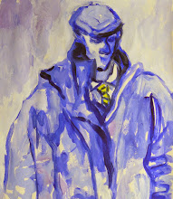
Facial Abstracts". It occurred to me that while I wanted to produce paintings which were largely abstract and expressive of specific emotions this could well be done by also thinking in terms of human faces which is where emotions can usually be seen. This would also provide a suitable link between Project 3: Abstract Painting, and Project 5: Semi-Abstract Figurative Painting:

Emotions Study 4, acrylics on canvas, 20x20cm.


Emotions Study 5, acrylics on canvas, 20x20cm.

I have 11 postings to make on this project and with only six more days till my holidays I will be posting twice-a-day. I know it's a lot but the good news is that there will be little in the way of text to read and more pictures to look at.

I hope very much you will make this journey with me and perhaps even leave a comment or two, and certainly, ask any questions of me. I will be happy to try to explain myself.

Tuesday, May 19, 2009

Scherzo Polyptych

"Scherzo Polyptych", Acrylics and paper collage on hardboard, 61x240cm.

Scherzo Individuals

The culmination of this project came in four days of intensive work starting with the decision to take a saw to my "Diptych" and create five individual paintings each one representing the five named fairies in Shakespeares play "A Midsummer Night's Dream. They are:

"Moth", acrylics and paper collage on hardboard, 61x30.5cm.

"Cobweb", acrylics and paper collage on hardboard, 61x30.5cm.

"Mustardseed", acrylics and paper collage on hardboard, 61x30.5cm.

"Titania", acrylics and paper collage on hardboard, 61x30.5cm.


"Peaseblossom", acrylics and paper collage on hardboard, 61x30.5cm.

Each individual is represented by a different colour, for example; 'Moth' is a light brown torn from wrapping paper, and she appears as a scrap in all the other panels, as do each of the others. Also, each panel has a reference to Mendelssohn's music with a small fragment torn from the bar notation.
They are intended to each stand alone but, of course, they were conceived as a polyptych, and can also stand together.

So, that's me for this project. I will go and have a lie down now before starting the next one!

Oh, I'll post the Polyptych so that you can see them together.

Monday, May 18, 2009

Scherzo Diptych

Firstly, I would like to welcome to this blog an artist who I have only just met but whose work I think is of the highest quality and I greatly admire: Mayaka Nakamura. Welcome Mayako.

Following the uncertainty which overcame me in my final piece from yesterday (I thought it was good but didn't know how to proceed) I laid that aside and started again, this time with the intention of following it through to a fuller, richer completion by building layer upon layer to create a painting of greater depth than I have ever achieved before. Each of the following Stages were completed on consecutive days.

I set up fresh boards on my studio floor and with renewed intention set off in time to the music:

Scherzo Stage #1. Acrylics on primed hardboard, 61x240cm.

Excited by this, but determined to build up further layers of meaning, next day I worked over the whole to "knock back" the white and try to bring some feeling of a Midsummer Night into the piece:

Scherzo Stage #2. Acrylics on primed hardboard, 61x240cm.

With this dull 'backdrop' I felt it necessary to bring some playfulness back into the Scherzo:

Scherzo Stage #3. Acrylics on primed hardboard, 61x240cm.

The playfulness I was seeking is certainly there, but it was the words of Leonhard Emmerling in his (Taschen) book on Pollock, when he was speaking about "Convergence: Number 10, 1952" that Jackson had used "...a range of colors that verges on the vulgar", and "...exudes a sort of delirium whose violence goes hand in hand with recklessness and lack of concentration". That decided me to work over the whole piece again - can't have any vulgarity here ye'know!:

Scherzo Stage #4. Acrylics on primed hardboard, 61x240cm.
With a large household paint brush and some emulsion paint I forcefully laid down a coat of white paint suggestive of ground mist and deepened the upper and lower portions.

I kept telling myself that what was important was the process regardless of what transpired - if it came from my subconscious then that was good. But that doesn't mean anything when you waken in the middle of the night in a blind panic! So much work and it was all lost by my own impetuous hand. How am I going to pluck victory from the jaws of disaster?

I have absolutely no idea.

Or do I?

Sunday, May 17, 2009

Project 3: Scherzo Action

Having worked for over five weeks experimenting and having tremendous fun with each different approach to making free abstracts it was now time to bring together all that I had learned and discovered and make my final pieces that hopefully would be good enough to stand for this project.

The previous posting (Action Painting) was the precurser to this - a warm-up, if you like. But what was it to be?

As often happens I probably do my best thinking in bed lying awake during the night ruminating on these things, and having made an extensive study the previous day on Wassily Kandinsky (an artist whose work I thought I didn't like, but after looking closely discovered I do, especially his earlier abstract painting) who also loved music and tried to capture the feelings listening to music generated I got my BIG idea: I would paint my own interpretation of the "Scherzo" from A Midsummer Night's Dream by Felix Mendelssohn. I love this music. It is the linking Intermezzo between Act 1 and Act 2 describing in music the fairy procession through the forest of Titania, Queen of the Fairies, with her 'changeling child' before they are "ill met by moonlight" by Oberon. [The link takes you to what I consider to be the definitive 1935 film version with the beautiful Olivia de Havilland as Titania, James Cagney as Bottom, and the brilliant Mickey Rooney as Robin Goodfellow - Puck, and the Scherzo starts properly at 4:00minutes. Worth a watch!]

To get myself into this concept I started with a couple of pastel studies made while playing the music over and over again:

Neocolours on paper, 3xA4+1xA3.


Dry Pastels on paper, 3xA4+1xA3.

The dry pastels allowed me more easily to block-in areas rather than just thin lines, although if I had wet the Neocolours I could probably have achieved the same end.

Next, I moved on to acrylics and made about four different versions, two of which are shown here:

Acrylics on paper, 2xA2ish.
I was trying here to get a better feeling for the forest at midnight.

Acrylics on paper, can't remember the size.
I've got the dancing movement, and now the concept has developed - The final piece will be painted as a diptych on two panels of primed hardboard, each 61x120cm making the final painting 2.4 metres long!

Using household paint and brushes I lay this first statement down:

Household emulsion on hardboard, 61x240cm.
Uncertainty creeps in. I like it but am unsure if it really what I want. It is the end of a hard's work and I am tired, so I will come back to it tomorrow to see where it should go from here.
(As a hint, I think better things are yet to follow ;o)