Friday, April 23, 2010

Saturn

Flying off at a bit of a tangent we arrive in orbit around one of the largest planets in our solar system, the sixth planet from the sun, second largest in our solar system, Saturn, a "gas giant" named after the Roman god Saturnus:


Although titled "The Bringer of Old Age" he was also a wicked old bandit who is said to have devoured his own children as shown in this painting by Goya:


But it is as the "Bringer of Old Age", as identified by Holst, that I turn my focus on. I think of those colours which speak to me of old age; yellows and blues, greys and mauves, like my granny's dresses, and her wallpaper [Please remind me never to wear dull colours].

This study in acrylics explores those feelings that arise:


And again:


The dots which have now appeared represent in my mind some of the 61 known moons (not counting the hundreds of small 'moonlets' within the rings).

"Titan" is Saturn's largest moon which I represent here as an old person being gently let towards her demise. After all, Saturn, according to the 1st century poet, Manilius, is "sad, morose, and cold, and is the planet of mortality" and that is why we speak of him as 'The Grim Reaper' and he carries a scythe whose shape is derived from the ring shape around the planet:

There is a bell shape in the top right-hand corner tolling the end of her life, and the planet disc (centre) has clock hands pointing to about five-to-twelve.

Or is that just time for a drink?

Thursday, April 22, 2010

The Sun/Apollo

In hot and fiery pursuit of the cold and fearsome Artemis we have Apollo, the sun god boiling with passion and desire.

This X-ray image of our very own shining star taken by the Yohkoh Solar Observatory in 1991. The structures that can be seen consist of large and hot coronal magnetics. This particular image, one of millions, shows an active corona from near the maximum of the solar cycle. At the upper right (solar northwest) we can see one of Yohkoh's original discoveries: an "X-ray jet" squirting outwards:


But, of course it is the personification of this star that I am interested in.

The Romans named our star Apollo, son of Zeus and Leto (a Titan), god of light and a fine figure of a man as this statue from 2nd Century AD shows:

Apollo was also the god of music as shown by the lyre in his left hand.

But here, still as god of music, we see him on the fiddle serenading the girls, and how they just love him!:

The "girls" are in fact the nine Muses who sing their accompaniment to Apollo's playing. This is part of a much larger fresco painting by Raphael and is one of four called "Parnassus" in the Stanza della Segnatura in the Vatican Palace (dated c1510).

With all this background information in mind the starting off point for my painting is that of a male figure (self portrait!) which I use on my own business card called "With Out-stretched Arms":

But here I am thinking too small - the sun's disc needs to be much larger and in fact so much larger it cannot be contained within the bounds of the picure!

Fresh thinking takes me back a stage and I make this charcoal value study which more suitably mirrors my painting of Artemis:

He turns towards her with arms outstretched inviting her to join him.

His passion is unbound, but still there is a Dark Side. He will not be refused and red-hot passion turns black with anger at her rebuff:

The flecks of gold on his cheek, running down his arm, and on the sun's corona counterpoint the silver on Artemis, his outstretched hands reach out and almost touch her hand.

These two paintings need to stand together if ever seen in exhibition.

Friday, April 16, 2010

The Moon/Artemis

Major breakthrough!

After a long, and sordid, battle with "Mars, the Bringer of War", which ended in a stalemate - no falls, no submissions, no knockout - resulting in a backing off, promising to "have a go" later when both parties are sufficiently recovered, a change of subject brings the results I am looking for!

Artemis, as the Greeks called her, or to us "The Moon", the only satelite of earth, and the only one on which Man has set his acquisitive foot. She is feminine and a beauty. She courses across the heavens pursued endlessly by Apollo, that masculine god of light forever chasing his opposite hoping to possess her.

The Moon is the largest satelite in the solar system:


Aristotle described the universe where the moon marked the boundary between the spheres of the mutable elements - earth, water, air and fire and the imperishable stars of Aether (personification of the upper sky) - space, and heaven.

Anaxagoras (Greek, 428BC) reasoned that the sun and the moon were both giant spherical rocks and that the latter reflected the former. His views got him imprisoned and exiled.
Oh, how we have progressed.
Or maybe not.

The starting off point for this subject was a pencil sketch made some time ago showing two female figures, but it is the right-hand figure that I focussed on:


Taking the right-hand figure and making a larger scaled study of her in Pastels:


As with all the projects, I need to do a value study to see the subject in it's simplicity, and to build up the design:


But, before I commit to paint, one last stage to explore the colour relationships:

Neocolour II's on paper, A2.

Then the final painting in oils:

Oils on board, 61x42cm.

She stands there with cold indifference, turned away from the hot-blooded Apollo who chases her, seeking her favour. She holds a bow in the shape of a crescent moon, with strung arrow pointing backwards towards Apollo dicouraging him from approaching too close. The Romans called her Diana "The Huntress" with her bow and arrows.

Apart from the original sketch, elements of this image (the raised right arm) are taken from a female model at Life Drawing Group, and the moon disc itself is the initial acrylics wash left untouched simply because i could not imagine myself recreating this bubbled effect any other way.

Flecks of tin-foil are pasted on to the crescent, up the girls dress, and on her face to emphasise that forbidding coldness.

The afro hairstyle just suits her.

Wednesday, April 14, 2010

Neptune

The eigth planet from the sun, Neptune is named after the Roman god of water and the sea. He was the brother of Jupiter and Pluto, and is analogous, but not identical to, the Greek Poseidon.

Neptune is an "Ice Giant" coloured blue as a result of absorption of red light by methane on the surface. It has 13 satelite moons, the largest called Triton, and it also has a dark spot similar to Jupiter's red spot:


The classical representation of Neptune is of this somewhat fearsome male figure with flowing locks and carrying a trident spear:


Wanting to bring a more contemporary slant the image I have had in my head from the outset the idea of a scuba-diver suspended up-side down in the deep-blue ocean with the planet seen through the surface of the water from underneath:

Pencil on paper, A4 Sketchbook page.
However, it felt like too much to show the full scuba-diving gear so, thinking about the pleasure I get from a simple snorkel and flippers when I go swimming with the fishes on Mediterannean holidays, this is how I will show him.

I am easily convinced that the concept is right and quickly turn to explore colour choices:

Neocolour on paper, A4ish.

Neocolour on paper, A3.

Acrylics on paper, A2.

The final painting remains close to the original concept as shown in the studies:

Acrylics on canvas, 61x42cm.

Neptune is diving deep underwater accompanied by his thirteen acolytes represented by 13 small fishes.

I would have preferred to have him holding a modern trident spear-gun but it never looked right so I left him with the simple spear. I may want to revisit this subject again when the course is finished but for the time being this will be presented as one of the 11 paintings I intend to complete.

Monday, April 12, 2010

Project 5: Theoretical Study

1.00 Introduction

The path to this door started, without any doubt, with the purchase of a book on the journals and drawings of the English artist, Keith Vaughan in 1972, and one ink and gouache painting in particular:

Group of Figures - Amacuzac, 1959“(1).

This small coloured drawing, only 36.8x31.8cm, had such a fundamental impact on me I have been continuously drawn back to it over all the intervening years frequently making copy studies of it. If only I could make images like that I would be a happy man.
What I saw in it was the simplified forms of figures overlapping one another in a sort of free for all jumble of shapes and lines, and although the illustration in the book is not in colour, in my head I could imagine what the real thing must look like. In many other paintings of his he would often use yellow ochre and blues as well as black.
What also fascinated me was the suggested shapes and forms of some background setting, perhaps a doorway, a wall? It was this ambiguity that always suggested more and always brought me back for more.

2.00 Keith Vaughan:

His Journal was begun at the outbreak of World War II and, having registered as a Conscientious Objector he joined the St John Ambulance Corp., there would be no opportunity to continue ‘normal’ life as a painter. However, with his life no longer his own, there would be many periods of inactivity to pass in the company of others which he recorded in writing and with small drawings, it’s purpose was “therapeutic and consolatory” (2). His journal continued for 26years until his death in August 1965.

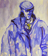
Influenced , as many artists of his time (and still are), by Pablo Picasso, with his simplicity of line and form, I in turn have been influenced by Vaughan’s manner of drawing. The quality of a portrait like this small study of a young man with the assured lines and solidity of form has been my inspiration to draw better:

Study of a Student”, 1950, 20x28cm.

But it is his colour studies such as this one of figures in a landscape which point towards a semi-abstract style of painting:

North African Scene”, 1965.

The figures are distilled down to simple, mainly rectangular, shapes and slabs of colour but also become part of the background such that you are unsure where reality begins and ends, an idea derived largely from Picasso’s Cubism.

We see that concept again in many of Vaughan’s studies for paintings like this one:

Boy with a Jug”, 1949.

The boy merges with his background and is also overlaid by unspecified elements in front.

In this charcoal study for a painting the features of the figure are further simplified and have become somewhat unnatural making for a more dramatic graphic image:


In the following illustrations of some of his paintings made during the 1960’s he has pushed the figurative much further into the abstract and much closer to the paintings of Nicholas de Stael whose work I’m sure he would have been aware of:

Three Figures in a Landscape”, 1960.

Bather”, 1961.


Study for Lacoon” 1964.

But it is the paintings in which the figures are simplified into fairly amorphous shapes standing and sitting in coloured settings which I enjoy most and would like to emulate. I like very much the idea of seeing a painting initially from a distance as an abstract with the colours and large shapes attracting my attention and interest but, on approach and closer inspection recognising the figurative elements:

“Ninth Assembly”, 1976.


Group of Dinkas”, 1963.

Assembly of Figures VII”, 1964.

This painting in particular I find very satisfying with the figures grouped closely together making a single mass of light browns and blues set against a field of cobalt and violet. I can’t say what the curved element may be but like the way it curves round the figures like a hook to draw us in.

3.00 Nicholas de Stael.

During the 1950’s, a period of painting I particularly enjoy, de Stael, a Russian-born émigré to Paris, was making his own highly colourful semi-abstract landscape and figurative paintings. His style, however was more abstract than Keith Vaughan’s and carried out with his own heavily impasto’d manner in oils:

Figures by the Sea”, 1952.

The figures are presumably lying on a beach mat and standing perhaps having a picnic by the seaside which can be seen as a patch of blue-grey, top left corner. The figures and surrounding objects have been simplified to rectangular shapes of strong colour laid over a dark background which has been allowed to show through at the edges. Their faces are only suggested by vertical coloured oblongs laid side-by-side.

Figure”, 1954, 130x80.6cm.

In some respects it is obviously a standing figure with two legs and arms framing it’s own head. The face is a simple white oblong perhaps with dark hair each side of the head. Other elements of the figure have been given individual slabs of colour which seem to be breaking away in movement? I am very attracted to the bold colouring and the simplification of form.

Parc de Princes”, 1952, also known as “Les Grand Footballeurs”.

This reminds me very much of a small acrylic painting I made for the OCA Painting 2 Course abstracting shapes and colours of footballers:

Spot the Ball”, 2002.

De Staels “Footballeurs” are treated with the same slabs of impasto colour laid on with staccato directional effect set against a uniform black background base and close greens above which give the painting a strong and clear design.

4.00 William Scott.

Largely known for his still life paintings it is his figurative abstractions that I enjoy most. Like many artists he was a figure drawer of great ability and as with most abstract artists the starting point of life as an artist. And, as with all other artists especially of the 1940’s onwards, obviously influenced by Picasso.


Representational drawing is quickly left behind for the more stylistic interpretations giving his figures a more simplified form such as this painting of a young woman:

Seated Girl”, 1937.

The figure of the girl with yellow blouse sitting on a chair in a red-walled room with darker red door is treated as a series of interlocking simplified shapes. The only details are patterns on the blouse and skirt and also the flowering plant. It has the feel of a Bonnard about it but you can see the beginnings of abstraction.

Seated Nude”, 1940.

This later painting also shows how the figure is being flattened out into simpler shapes. Changes in colour values are still present indicating form but essentially the figure is becoming less realistic.

Girl and a Birdcage”, 1947.

In this painting the figures of both the boy and the girl have been ‘flattened’ out and along with the background has become more like a graphic or poster design.

By the 1950’s Scott was treating his figures like his Still Lifes with exaggerated limbs - either elongated and thin or blocky and fat - necks are drawn out and hands and feet are barely without digits:

Seated Girl”, 1954.

Bending Figure”, 1956.

Another preparatory drawing in ink on paper, 63.5x48.2cm, for a painting with the girl bent over and her body looking like one of his own table-tops tilted up so that we can see the full flat surface.

This type of drawing would precede paintings such as this:
Figure: Red and Black”, 1956.

The figure is massive and altered so much away from reality it has become a huge red canvas in itself, heavily marked and scratched with layers of colour, and blocking out the white chair she is sitting on. The background is a series of dark, nearing on black, rectangles with touches of red showing through.

Finally, in this painting the figure is laid out horizontally and if it wasn’t for the legs separated by a portion of the bed she is lying on it would hardly read as a figure at all:

Reclining Nude”, 1956, 91.8x152.7cm.

5.00 Conclusions

While the drawings and paintings of Keith Vaughan may have set me off on this path of semi-abstraction I have been fortunate to find many others that work in much the same manner. And while most of these happen to have been active around the 1950’s and 60’s there are still painters around who follow, I believe, in the same footsteps. For example the work of Jacqueline Watt, Scottish contemporary painter and tutor for the OCA, has been a frequent source of inspiration any time I have been fortunate to see her work. I wish to be able to follow in her giant footsteps too.

6.00 References.

1. “Keith Vaughan: Journal & Drawings, 1939 - 1965“, page 168.
2. Introductory preface, p7.

7.00 Selected Bibliography.

1. “Keith Vaughan: Journal & Drawings, 1939 - 1965“. Publ. Alan Ross London, 1966.
2. “William Scott”, by Norbert Lynton. Publ. Thames & Hudson, 2004.
3. “Roger Hilton: The Figured Language of Thought” by Andrew Lambirth. Publ. Thames & Hudson, 2007.

Saturday, April 10, 2010

Project 5: Semi-abstract Figurative Painting

This is where all the work I have been doing has been leading towards: what I have been calling a "Semi-Abstract" style of figurative painting.

I have waited till now to post up the paintings I have been making partly due to the uncertainty that firstly, they are worth showing, and secondly, that they meet the criteria I have set myself.

I am very uncertain that they meet either standard.

Regardless, there is no turning back. I have presented those pieces of work which I had finished to the OCA tutor and duly received my "Tutors Report" and "Certificate of Completion".

I could stop there and rest on my laurels and do nothing more since I had completed all that I set out to do.

Except I haven't.

What I have done is, even to my mind, the culmination of a fantastic journey but I still need to get some perspective on it, and also complete a couple of paintings so far undone. I also intend to apply for an "Assessment", submission for which is at the end of June this year. So still some work to do.

At the outset I was so nervous about posting all this work for the world (or at least those foolish enough to stop by at this address) that I restricted access and comment to a very few people. Not all took up the invitation to be included, and not all chose to leave any comment. For those that did I would like to express my gratitude for you taking the time to look and voice your opinions.

Now I am much more relaxed about it all and therefore have removed the restricted access and invite anyone to look and comment. All I would ask is that you are at least constructive.

The Project:

One evening last August, having just had a break from working on this Course, I was lying about wondering what theme I would choose to hang this final project on (for I always must have a theme). Watching and listening to the BBC's Proms Season they were playing Gustav Holst's "Planets" and I knew this was the ideal vehicle for me: seven planets (at the time of his composing in 1918), plus Pluto (which was discovered in 1933, even though it is only considered a Binary Dwarf planet), and to which I have also added the Sun (Apollo), The Moon (Artemis), and of course The Earth (Gaia) making potentially 11 paintings in all.
This combines my love of painting with my love of music and also my love of Space, the final frontier. To boldly go....

My intention was to represent each planet with it's personification, not as the ancients (Greeks and Romans) had already done (although I would take all that mythology into account), but with a contemporary take.
Could I do it?
We shall see in the following postings.