Friday, March 27, 2009

Project 2: Theoretical Study

So this has taken me a while to get round to since I've been all over the place - skiting across the sky at 35,000feet, swaning around the streets of Milano dazzling the locals with my sartorial elegance, and stuffing my face with pizza's and pasta's (not to mention the vino)!

I wasn't sure how to present this since it's 15 pages are too many for Blogger at one time, so I've photographed them in threes to get to that magic number 5.

This, of course, presents it's own difficulties with the text appearing so small and at times a bit blurred. Still it's the best I can do and I hope you are able to get the gist of what I'm talking about. I also know it's a lot of reading and you all have busy lives, but I wanted to show you what I had been up to instead of just sitting around pontificating into thin air.

You should know that when I first started this epistle I immediately set off on the wrong direction, concentrating on the sexual aspect of both Schiele's and Vettriano's images. Fortunately I realised in time that this was not what it should be about and quickly turned it around to focus purely on how they each created their figurative paintings. Phew! So here it is, hope you can read it by clicking each pic to enlarge:


It isn't as polished as I would like, and I may even have missed opportunities left, right, and centre, but when I read it again I am fairly satisfied with the content.

Saturday, March 7, 2009

Project 2, Painting 5 : Ugly Beauty

To complete this set I wanted to finish with a flourish, but didn't have any more sketches from The Sleeping Beauty, so I chose this sketch from the Trocadero series.

Having felt that I didn't do quite as well with Paintings 3 & 4, I wanted to lift myself up (metaphorically and psychologically, you understand, not physically on the end of some blokes hairy arms) so I set about these studies with some gusto following the same process as before:


Study No.4: Rollerball on paper, Sketchpad 1 (A4).
It took me four drawings to get to this one which I really liked for it's simplicity and style.

Then moving up in scale:


Study No.5: Neocolour II on cartridge paper, A2.

This just thrilled me! Sometimes the lines are effortless.

Moving on to painting:


Study No6: Acrylics on cartridge paper, 45x61cm.

Satisfied with the loose flow of paint and the values.

No holding back now, I start what I hope will be the final painting. I had been working well that day and was confident I knew exactly what I was going to do:


Start on final painting: Oil pastels on primed hardboard, 45x61cm.

I shouldn't get so cocky! This was the third attempt to get the initial drawing right. Since I don't like to "square-up" my design onto the painting board I rely totally in my ability to judge the proportions correctly first time...or second, or even third time. But that's what a clean turpsy rag is for - wiping the oil pastel off and re-stating till it is right.

Having eventually established the design, and also having spent a fair bit of time mixing suitable amounts of the main colours, I boldly lay on those colours starting with the ballerina's arms and head working my way down to the bottom edge in a series of almost uninterupted movements:


Final Painting: Oils on hardboard, 45x61cm.

I really think this one needs to be seen in actuality to appreciate some of the colours and textures (my photography is getting worse, perhaps I should do a blog about photographing finished artwork and how to get the best results?).Regardless, this painting does in fact bear close scrutiny and leaves me with a big smile and highly satisfied that I did indeed finish with a flourish!

Sunday, March 1, 2009

Project 2: Painting 4

In my Course Plan I proposed to complete four paintings and so, for this my final painting in the series, I start again with yet another sketch from Sketchbook 1(A6), re-drawing at a larger scale (A4) to get the feel for what this image is about:


Pencil on paper, A4.
Immediately I see that with the full extended limbs this painting will need to be wider than high, with a proportion of about 1:1.2, or more.
Now, in itself this has the potential to look grand and fantastic, but there is an awful lot of blank space. My previous three paintings have all been more successful (I think) when I cropped tighter into the figures. The question is: What does this painting require?
I therefore carry out this study to consider what the right proportions should be:


Rollerball and felt pens on paper, A4.
With no definite conclusion (I have been feeling very indecisive of late) other than each of them could make a decent painting, I decide that if I crop in tight to the figures I will be tending towards the abstract and that is not what this Project is about. So I'll leave those paintings for another day and stick with the full monty!

To reinforce this concept in my mind I do a whole series of pastel studies, of which this is one:


Neocolour on paper, A3.
I could do this sort of drawing all day long but there comes a time when I need to get painting:


Acrylics on cartridge paper, A2.
With some blue mixed with white and a soft watercolour brush I "draw" the figures with as much energy as I can muster, blocking-in with directional strokes.

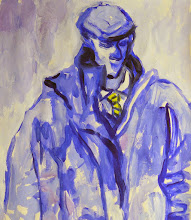
Satisfied that this is going in the right direction the next working day I make a start on the final piece in oils:


Oils on board, 67x61cm.
I may have changed my starting method from first two paintings by drawing the figures with oil pastels first but at least this way I can be sure to get their hands and feet on the board! I can go over the drawing as often as I like till I am satisfied with it, and even wipe off and start again if not.
Painting starts with a pre-mixing session, and, with loaded brushes lay-in the figures first, then cut-in with the background colours.

I am pleased with the end result in many ways but also think it is a bit formal and stiff, even though my confidence in the manner of paintinig I have developed has grown by continuous repetition.

Now I know this doesn't help you the viewer but my photo of this painting is not what it should be for you to appreciate the depth and brightness of colour, and also the free brushstrokes. You will just have to take my word for it, and I will need to find a way to somehow correct this.

Summary of Achievement 4:

1. Completed another painting to my satisfaction.

2. Feeling more confident of the process and my ability to see it through to completion.

3. Even when difficulties arise I am able to remain calm and think through the problem to a satisfactory solution.

4. Every time I paint I grow in confidence and my painting becomes looser.

5. By drawing out my design with oil pastels first I exercise more control on the process and eventual outcome. Painting directly, while having some merit in a loose and freely expressed image, leaves too much to chance, particularly with this figurative subject matter if I want it to look like the way I designed it.

6. While this painting is not to me as successful as previous three paintings, for reasons of design, I am still pleased with it.