Tuesday, July 20, 2010

Assessment Portfolio

My portfolio of Paintings, Logbooks, Notebooks, Sketchbooks, Sketchpads, Extended Written Project were sent to the Open College of the Arts on 10th June 2010:

Supporting Material
This is selection was about two-thirds of the total.

For assessment I chose to send two paintings from Project 2: Figure Painting; two from Project 3: Abstract Painting; and two from Project 4: Painting Feelings and Emotions, seen here mounted on A1 boards:

From top left they are: "Flying Beauty"; "Ugly Beauty"; "Moth" and "Mustardseed" from my Scherzo Polyptych; "Joy" and "Anxiety" from my Facial Feelings

Eight paintings from my Planets Suite were also sent, with "Mercury" in addition to the seven shown here:
From top left they are: "Neptune"; "Artemis"; "Saturn"; "Jupiter"; and bottom row: "Apollo"; "Gaia"; "Venus".

All paintings would be contained within a this mounting-board portfolio seen here inside it's packing case before despatch:

Both packages were delivered by courier on 11 June 2010.

The timescale for assessment is:

1. Delivery of portfolio by 15th June 2010;
2. Assessment to take place during July;
3. Notification by August;
4. Return of portfolio by 30th September at the latest.

And so all my work for the Project is finished and now all I can do is wait for the results.

Monday, July 19, 2010

Completion

Certificate of Completion
Hard to believe but there you are.

And was it worth it?

I'll let you know sometime.

Sunday, July 18, 2010

Tutor's Report and Student Review of Course

Tutor's Report


Student Review of Course

In committing all my energies to this Course I was seeking to develop three broad outcomes:

1. a strong personal painting style.
2. a consistent quality in my painting;
3. a more professional work ethic.

1. Painting Style: At the outset I designed for myself an engaging work plan which has taken me on a great adventure starting with a reprise of where I had already got to in my painting with expressive figure compositions; the exploration of ‘pure’ abstract forms; a narrowing down to focus on how ‘feelings and emotions’ could be expressed in paintings; and finally bringing all this knowledge together in a suite of paintings personifying the planets in our Solar System in a semi-abstract manner.
In doing so I have allowed myself time to explore different use of materials and approaches, for example, the mixed media ‘action painting’ of my Scherzo Polyptych; the free expression of painting emotions in my Facial Feelings set; and the telling of stories in my planets personifications which was painted while listening to Gustav Holst’s Planets Suite. With this body of work a strong personal style has emerged.

2. Consistency: The confirmation of a painting process which suits my own personality and strengths was important in achieving all of this, and any time I strayed away or tried to cut corners resulted invariably in difficulties. This process would start with a basic idea which could then be researched in books and on the internet making notes in a Notebook and drawing images in a Sketchbook which would then be developed through composition and colour studies in Sketchpads, value studies and colour studies in paint to larger a scale, before finally committing to painting the final piece. Nothing new there for an artist but I have made it my working process and providing me with the greatest likely-hood of achieving success in my painting.

3. Professional Working: Coming from a professional working background it was not difficult for me to re-establish the protocols of professional life with letter writing, arranging meetings with the tutor, setting Agendas, note-taking and issuing reports. Prior to this Course these things had been somewhat disregarded. It is good to know I still have the capability and how important these things are when dealing with other professional people.
Also, since in my previous working life work started at 9am and finished around 6pm, I accepted that this was ‘normal’ for me and I re-established this for my artistic endeavours. This enabled me to put in full working days that helped me achieve all that I have in this Course and given me a great sense of satisfaction each day.

Finally: It was originally my intention to complete this Course within one year, and that was achievable at the pace I set, however, it didn’t take into account the death of my father and my subsequent loss of focus and motivation preventing me from working for at least three months. It was difficult to get back into the Course after that but I am pleased to say I have been able complete this Course as strongly as I started.

Project 5 Commentary

This commentary for Project 5 was written in January this year for my final meeting with the OCA tutor. I had completed eight of the paintings but still had three to finish, and therefore, as far as OCA was concerned, I had effectively completed the course.


1.00 Introduction: The concept for this project arose while listening to a performance of “The Planets” by Gustav Holst. I knew immediately that this was the ideal vehicle for me to combine my interest in Space and Music with personifications of each planet in my own manner of semi-abstract painting.

2.00 Research : Holst scored seven movements to his Suite in 1914 expressing his own musical vision of all the known planets at that time. To increase the list to make a fuller project I added Pluto (which was discovered in 1930), The Sun, The Moon, and, of course, The Earth. First I researched both the astronomical facts regarding each planet - particularly their real colour and how many moons they had, and also their mythology as believed by the Greeks and the Romans.
I then made study of artists already known to me whose semi-abstract and figurative work I like, namely: William Scott, Roger Hilton, Keith Vaughan, and Nicholas de Staƫl.

3.00 Life Drawing: Recognising that figure drawing was fundamental to a painting project built on knowledge of the figure I resumed Life Drawing practice and was able to incorporate elements of those studies in my paintings.

4.00 Sketch and Painting Studies: If there’s one thing this Course has taught me it is that a process of exploration and discovery has to be followed especially where the subject is largely unknown. That was the way of it in previous projects and that was what was required in this one. So, allowing myself time to carry out what often appeared fruitless and frustrating explorations of form and technique through many and varied studies in sketchbooks, sketchpads, and paintings, often discounting unsatisfactory attempts, until the actual solution presented itself.

5.00 Final Paintings: The first two paintings, completed in mixed media/acrylics, were ‘Neptune’ and ‘Mercury’. However, having worked around, and around the subject of ‘Mars’ for many weeks without a satisfactory conclusion the breakthrough I was searching for presented itself eventually when I abandoned trying to paint in acrylics and returned to oils. Each of the following final paintings flowed naturally and easily from each other starting with my personification of ‘Venus‘, ‘The Moon’ (Artemis), ‘Saturn’, ‘Jupiter’, ‘The Sun’ (Apollo), and ‘The Earth’ (Gaia).

6.00 Still to Do: I have conceptual designs for both ‘Uranus’ and ‘Pluto’ which require to be completed, and, of course, I still have to return to ’Mars’ to complete this painting satisfactorily.

7.00 Programme: A total loss of focus and interest at the very beginning of this Project 5 due to family bereavement resulted in my falling behind by at least two months. With three paintings still to be completed, and also given that most are in oils which are still not yet dry, I will not be able to submit for this January’s Assessment hand-in. It is my intention now to delay this application until June 2010.

Saturday, July 17, 2010

Pluto, God of the Underworld

This is the final posting for my Planets Suite making eleven in total.

Like Apollo (the Sun), Artemis (the Moon), and Gaia (the Earth), Gustav Holst didn’t write music for Pluto since by the time it had been discovered in 1930, a year before his death, Holst had become so disillusioned by the great popularity of his Planets Suite he felt at the expense of all his other work.
I, unfortunately, have no such inhibitions.

As with all previous planetary entries I start with the planet itself.

Discovered in 1930 by the astronomist, Clyde W Tombaugh, Pluto is in fact a ‘binary dwarf’ meaning along with its largest moon, Charon, the barycentre of their orbits does not lie within either body. Together they also have another two moons, Nix and Hydra:


And it was these four together that led me to the concept of a four-piece rock band, and the Fab Four in particular - the Beatles. I thought of the two conjoined principals like John Lennon and Paul McCartney, and the two moons as George and Ringo. And potentially the Ringo’s base drum doubling as the planet disc:

The Beatles


But it was my research on the mythology of Pluto that began to lead me in a slightly different direction.

Pluto, (or Hades in Greek) was the Roman god of the underworld. And he must have been a bit of a sad-sack since he was loveless (aww). In order to bring love to him Venus sent her son Amor (Cupid) to shoot him with one of his arrows (hooray!). This caused Pluto to seek out a lover and coming across Prosperina (Persephone), his neice (from his brother Jupiter and Ceres) bathing at a pool he did the dastardly caveman thing and abducted her, taking her to Hades as his wife and queen.

But since Pluto is also the god of the dead, of infernal regions, of the terminally ill, and those wounded in battle, I began to think that the Beatles were too clean an image and therefore the band should be more gothic or heavy metal.
Or even punk.
This in turn led me to a post-punk band called "The Naked and the Dead" which absolutely hit the mark for me. Talk about Cupid’s arrow of love? This was a marriage made in Hades!:

The Naked and the Dead Sketches
Pencil in sketchbook, A6x5.
Sketched from their My Space and other internet pages.

And from these six sketches came the final concept:

Pencil in sketchbook, A6x2.

Which, in turn, was translated into a black and white study:

White chalk on black card, A4.

Refined and developed further:


Overlaid and defined with some colour:


Figure shapes developed:


Happy with this scheme I then started in oils placing the figures with titanium white over a previous ‘failed’ painting (I think it was an attempt at Venus):

Lots of texture and flecks of colour showing through.

Final Painting
Oils on canvas, 42x61.
This is the only painting of my Planets Suite to be in landscape format. I couldn’t conceive it any other way.
And it is also the least perfectly painted. Or perhaps the most perfectly painted?
Most perfect and most appropriate to the post-punk underworld cancerous subject of death and rotting corpses!

What a fitting way to end on.

Postscript: The band could be called “The Plutonics” and their band logo, seen on the bass drum is, of course, Walt Disney’s puppy dog, Pluto. What else?

Friday, July 16, 2010

Uranus, The Magician

Just to surprise us with a bit of magic, the planet Uranus stands on end with his rings in a unique axis of rotation - tilted vertically with North and South poles where other planets have their equators. Neat trick!:

Uranus the Planet Photo taken by the Hubble Space Telescope.
Uranus is the seventh planet from our sun. An ice giant it has 27 natural satelites, with the five largest named: Miranda, Ariel, Umbrial, Titania, and Oberon from works by Shakespeare and Poe.

In mythology Uranus is named after the Greek deity of the Sky, Ouranos, or Father Sky. He is the father of Cronus (Saturn) and grandfather of Zeus (Jupiter) and is personified as the son and husband of Gaia, Mother Earth.

The concept for this painting was therefore not too difficult - my Uranus would be presented as a modern day magician, and the very first one that sprung to mind was David Nixon whom I used to watch and love on TV as a boy:
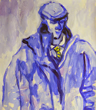
David Nixon
Naughty boy that I am, I considered somehow to have the planet disc represented by Nixon's bald head! But no that would be too disrespectful.

Next magician to come to mind was another great favourite, mainly because all his tricks usually went wrong, Tommy Cooper:

Tommy Cooper
"Not like this, like that, ha ha ha!"
I thought I might be able to do something with his fez.

These ideas were really just "scratchings" - digging around to see what ideas might arise.
But the real starting point for the painting was approached similar to those of my "Facial Feelings" with colours and shapes I felt would best describe the mysteriousness of a magician on stage:

Design Study 1
Neocolours in sketchpad, A5.
Mostly dark colours - black, midnight blue, purple set off with a few flashes of brilliance - turquoise, orange, pink, referencing the magicians dinner suit and curtains on the stage with high points of intensity - the lights, the moment of revelation.

I like this study very much and will make a painting of it sometime, but this project needs figures to tell the story, and it is in my sketchpads I spend time searching for a suitable manner of combining figures with these colours:

Design Study 2
Neocolours in sketchpad, A4.
Every magician needs a lovely assistant and it is here that I have introduced Miranda as his helper. But what can she be helping with?:

Design Study 3
Neocolours in sketchpad, A4.
I have her holding up a large disc, also representing the planet, for Uranus to work his magic on.

The idea is beginning to gel so I work it up as a watercolour sketch:

Design Study 4
Watercolours in sketchbook, A4.
Playing around with different elements trying to get something that satisfies.

Beginning to firm up on the design with a final, full-size, design study:

Design Study 5
Neocolours on paper, A2.
Uranus has developed into a suave gentleman in black tuxedo and cape with red lining, a neat bow-tie, long thin moustach and goatee beard, holding a magicians wand in one hand pointing to the planet disc, and a top-hat in the other from which he may later produce a rabbit or some doves!
Miranda wears a short pink dress and her long flowing strawberry-red hair, tied with a bow, cascades down her back. She holds up the disc like a paper-covered hoop or balloon, which, on the words of abracadabra will burst open to reveal...what? Who knows, but it will be magic!

With the final painting, in oils, I run into some difficulties. The figures are stiff and not to my liking. They are even somewhat cartoonish with Uranus's extended arm:

Final Painting?
Oils on canvas, 61x42cm.
This is as far as I could take it at the time so it was laid aside for a while to contemplate what to do with it.

Still contemplating.

It needs a final going over.

Wednesday, July 14, 2010

Mars, The Bringer of War

This painting was undoubtably the most difficult for me to complete.

The conceptual and development studies all took place during the Autumn of 2009 but I could never get to a definitive solution until Spring 2010. In some respects, therefore, all the experimentation and perseverance helped me develop the semi-abstract language I was looking for in each of the other planets, if not entirely in this one.

The planet itself is known as The Red Planet due to it's high iron oxide content:

Mars the Planet
This high-resolution photograph was taken by the Hubble telescope in 2001 and shows clearly the reddish appearance of the planet with it's polar ice-caps.
The planet has two irregular-shaped moons called Phobos and Deimos which are the mythological sons of Ares, the Greek god of war. The Romans called him Mars:

Mars the Statue
This statue stands in the grounds of the Villa Hadriana at Tivoli near Roma where the emperor Hadrian preferred to reside while in Rome. It shows him as a fit young warrior with helmet and shield. I originally thought his shield could double for the planets disc but as I developed the concept for a more contemporary representation of him this idea was soon discarded.

My modern concept arose from the thought of Ares going into battle with his two sons, Phobos (meaning panic/fear), and Deimos (meaning terror/dead), as a present-day street gang-leader with baseball cap pulled down over his face, and his two hooded pals:

Mars, Bringers of Street War: Study
Acrylics on card, 40x30cm.

This was developed into a larger painting in oils:

Mars, Painting 1
Oils on canvas, 61x42cm.
Mars' two cohorts have now been given logo's on their t-shirts representing their Roman names, Timor (terror) and Fuga (fear) with the red planet disc hovering above in a field of black.

While I like this image very much it is more like my usual expressionist painting than semi-abstract which made me try again by simplifying the figures and the red and black shapes:

Mars Abstraction Study 1
Acrylics on board, 61x42cm.
Here I also experimented with the idea of bright orange/red running down the picture like running blood.

And while I really like this image very much again it wasn't what I thought I wanted. So I set off on a further round of studies to try to find that elusive semi-abstract form I was looking for:

Mars Abstraction Study 2
Watercolour on paper, ?
In order to break through the circle I was revolving in I literally turned it around into landscape format and began to think of Mars in close-up, lower face covered with a red scarf, and one of his gang raising one arm in Nazi salute to the planet disc and the other holding a baseball bat.

This has great possibilities but at the time I decided that, with all my other paintings in portrait format, I wanted to keep that principal going.

Keeping with the same design concept I returned to working in charcoal and Neocolours to develop a series of portrait format studies:

Mars Abstraction Study 3
Neocolours on paper, A2.
This is more like it! With this study I am excited again by this Mars project. A lot of work still to do especially when I try to turn it into a painting:

Mars Painting Attempt
Acrylics on canvas, 61x42cm.
This is one of many attempts made using acrylics on canvas that quickly ran aground due to dis-satisfactions with the medium more than anything. I also had become dis-satisfied by my attempts at including lettering on the image - it began to feel more like illustration rather than painting.

At this point in this attempt at this painting I stopped. I needed time to digest where I had got to, not just in this painting, but in the whole project.

For two weeks I ruminated on what was going on until I turned my attention away to another planet, Venus, which after all this work on Mars came together more easily. The others followed in quick succession - Artemis, Apollo, Saturn, Jupiter, Mercury.

Only then did I return to Mars to apply what I had been able to do with the others, working over the previous (failed) acrylics painting I laid down this final painting in oils:

Mars, The Bringer of War
Oils on canvas, 61x42cm.
It retains many of the elements from previous attempts but I have ditched the t-shirt lettering and have included the running, splattered blood!

Wednesday, July 7, 2010

Mercury, The Winged Messenger

The planet Mercury is a fairly unremarkable lump of rock, being not unlike our own Moon with it's pitted and scarred lunarscape:

Mercury That's what becomes of taking up residence so close to the sun!
It has no moons and therefore it is to mythology that I turn for inspiration,

Hendrick Goltzius's Mercury
Here, Goltzius has shown Mercury bearing the Heralds staff with entwined snakes, accompanied by his companion cockerel, and a winged helmet.

My first thoughts were centred on the idea that my Mercury would have wings in the form of a silver foil band running down the length of his upstretched arm:

Concept Study 1
Unfortunately it was too dis-similar to all my other paintings and since I was striving for consistency in all matters, especially end result, I abandoned the idea and re-considered.

What followed was a period of "scratching". This is a term I picked up from a book by Twyla Tharp called "The Creative Habit" and refers to what all creative people go through while trying to generate ideas - research, casting around to see what other people have done, opening up to possibilities from whatever source. I went 'scratching' through old portfolios and sketchbooks which turned up this comical figure made a number of years ago:

Self-portrait with Hair and Extended Arms
Pastel on paper, A2.
Once I had stopped laughing I thought that this would make a good Mercury with arms out behind like wings as though he were flying.

The process then begins again with studies in my sketchpads, working around the idea to make it into a suitable image:

Sketchpad Sudies

Here I have included Mercury's herald staff with the twisted snakes and his cockerel companion which I have placed on his shoulder to provide some uplift from his flapping wings. Trying to simplify the design into simple colour fields I have set the figure between the dark sky of space behind and a bright yellow/orange representing the sun's blast of heat and light. Also, to suggest forward movement there is a light blue edge along Mercury's back and arms intended to represent an image shift.

This concept is worked up to a larger scale to see if it still holds water:

Colour Study 1
Pastels on paper, A2.

I somehow manage to convince myself and proceed to painting in oils:

First Attempt at Final Painting
Oils on canvas, 61x42cm.
The planet has mercurial flecks of silver foil and also collaged to Mercury's chest like a breastplate, and his cheekbone, creating visual links between the figure and the planet.
In an attempt at introducing a contemporary element, and since very few people I know have hats with wings on them, I have given Mercury a baseball cap turned around to provide a bit of backwards motion.
But this is where I really come unstuck: I extended the light blue image shift down his back and out from his heels to represent some sort of wings at his ankles but only succeeded in making him wear high-heeled shoes!

All was not lost, however, and now also as part of my painting process I am not afraid to destroy all that I have done so far by scraping all the paint back leaving a multi-coloured, multi-textured, base from which to rebuild:

Final Painting
Oils on canvas, 61x42cm.
The concept remains mostly the same but now I have made changes:
i) The light blue image shift line has been removed;
ii) The cockerel has had it's neck twisted and put in a pot to make soup;
iii) His headgear has been extended backwards more like a cyclists helmet to provide better shape and greater speed;
iv) He now has a pair of Nike sunglasses;
v) I have re-introduced the red t-shirt to make him stronger and more potent;
vi) The paint has been applied with richer variety and texture.

I am now not only pleased with the end result but pleased I kept my nerve when things were going badly wrong!

Tuesday, July 6, 2010

Gaia/The Earth

Holst, of course, didn't include The Earth in his planets suite, and for what reason I don't know, but for me it is not possible to omit our own home planet. All the others are just lumps of rock, ice and gas but home is where the heart is. Where life is.

And the concept for Earth's personification arrived one day at Life Drawing Group in the shape of Clare - a beautiful young woman with Pre-Raphaelite looks and eight months pregnant:

Clare
Charcoal on paper, A2.
I have attended Life Drawing Groups over many years and this was the first time I have had the pleasure of drawing a pregnant lady. I knew immediately that Clare would be my Gaia.

Taking this original drawing as a starting point I began to modify and develop the idea of her holding her belly like a globe which I initially thought would represent in itself the world:

Design Study 1
Charcoal on paper, A2.

Since the Earth is the fount of all our existence, past, present, and future, I began think of her with children in her arms and around her feet:

Design Development Sketches

Pencil in sketchpad, A5x3.
Starting with a single child, then considering her with others, but finally coming back to her having only one child beside her, since there is only one satelite - the Moon. This is the study I choose to progress with.

But before I launch into final painting I need to warm up with a full-size painted study to convince myself that I have the values right:

Value Study
Acrylics on board, A2.
The placement of elements is as I want with the curvature of the Earth coming in from the top encompassing Gaia's head; the two figures of Mother and daughter almost full length, and the Moon's disc just behind her shoulder.

Satisfied with this I commit to painting in oils:

Final Painting
Oils on canvas, 61x42cm.

Monday, July 5, 2010

Jupiter, The Bringer of Jollity

The fourth planet in Holst's suite is the giant planet of Jupiter to which he added the title "Bringer of Jollity". Now, this word 'jollity' is a strange one which I think I know to be derived from the word 'jolly', but since I am unsure I have to look it up in the dictionary. Sure enough it is listed as "merrymaking" and "festivity" which I already knew from the tempo Holst set for the piece: Allegro giocoso. "Allegro" in Italian meaning 'cheerful' or 'merry', and "giocoso" from the verb giocare, to play, or playful.

So this is the idea that is rolling around my mind as I set off to develop my programme for this painting: it should be fun and jolly, even though that is very much not what Ingres conceived him to be:

Jupiter and Thetis

Even Thetis is trying to encourage a smile from his sullen face but he is having none of it!

Research on the physical planet itself reveals that it is a gas giant and the largest planet in the solar system. So already I can see he needs to be 'larger than life'! Jupiter has over 63 moons with four principal satellites - Io, Europa, Ganymede, and Callisto. The planet also has this distinctive Great Red Spot:

So plenty there to work with.

My next task is to come up with an idea for his personification which can then be developed in a semi-abstract manner.

Last year at Halloween many of the Celebs were all going out to fancy-dress costume parties and I came across a photo of the pop singer Pink in this fantastic clowns dress:


Now, here's the thing; Jupiter is a man and Pink is a woman, but since when did that stop traditional male circus clowns from dressing up in a frock for fun and to get a laugh?

The concept of Jupiter as a clown in a brightly coloured dress with spots representing all the fifty-nine smaller moons and holding the strings of four balloons, each one representing the four major moons, sounds like a lot of fun to me!

Colour Study 1

Neocolour in sketchpad, A4.
I made many studies like this one searching for the right arrangement of colours and shapes, but this one shows best how that part of the design development went.

Value Study 1

Charcoal on paper, A2.
The design rolled around for quite some time with studies like this one but somehow I wasn't satisfied with the central positioning of the figure, but by turning the clowns face to one side I could then see the possibilities of showing his big red nose better in profile.

Value Study 2

Charcoal on paper, A2.
Next stage in the design development came with a shift in placement of the figure to one side and not showing the full-length figure. Also, by turning the clowns face to the other side and slightly downward, away from the balloons he is holding, introduced a kind of sadness which is so often the other side of a clowns jollity. On his left arm are two tattoos, one for his wife (and sister [you know what these mythological gods were like]), Ceres, and an anchor just to remind you he is in fact a male in this dress costume :o)

Colour Study 2

Neocolour on paper, A3.
This is the design I choose to paint:

Final Painting

Oils on canvas, 61x42cm.