Again, in my pursuit of consistency, I will be describing the same process as before starting by re-drawing the initial sketch to a larger scale and also giving some thought to composition:

Pencil on paper, A4 sketchpad.
I am ambitious to widen the scope of these studies by including more figures but decide to restrain myself and keep it to just two for the present. It's hard enough without trying to do too much for a project designed as a simple introduction to the main fare.
Next stage is to consider values:

Small thumbnails in an A4 pad using felt pen, to which I add some acrylics black, white and grey, and also rollerball pen, both trying to best place the figures.
The idea is formed and this is the design I am going to pursue, so I start thinking here about colour:

Felt pens and Neocolour II on paper, A4 sketchpad.
I hope you understand just how difficult it is for me to remain focussed and not stray away from the Grand Plan in my head!
Here I wander off in a new direction thinking about changing the colouring to warmer mauves and purples which I think will be more "Regal" for Little Miss Sleepy-Head:

Neocolours on paper, A3 sketchpad.
In this study I manage to convince myself that even though there is an awful lot of wide-open space around the figures it is OK since a painting needs quiet areas to offset the busy areas, doesn't it?
At this point I just want to get painting. I think I have done enough studies which, after all, are just continuations of what I did for the first two paintings.
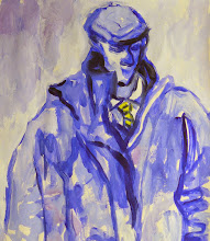
Now, I don't mind showing some of my disasters for all our edification but there is a limit. Suffice to say that the first attempt with the mauves and purples was dreadful! Either my mixing was simply not good enough or when I actually saw it in reality it didn't look right. In any case I decided that if and when these paintings were to be seen together (as at the Assessment for instance) then it would be much better if they looked like a uniform series.
All the paint was scraped off and I started afresh again without any pre-drawing I launch straight in by painting the ballerina with loaded brushes, and then her supporting male dancer, and then cutting in around the figures with the background:

Oils on board, 61x61cm.
All was going swimmingly well and I was definitely enjoying the painting experience, but when I stepped back and looked with a critical eye I knew something was not quite right...something I didn't like.
For the answer to that you will need to come back tomorrow.
ttfn!
1 comment:
why not keep some of those lovely scribbly marks in the final image?
I'm thinking of some of William Gillies better work here or Schiele
Post a Comment