This Extended Written Project was completed, and the Draft discussed with the OCA Tutor, last August, but for a variety of reasons I wasn't able to publish it until now.
The subject is an exploration of how feelings and emotions can be expressed through paint, and while it does look at and consider how other painters, both from history and present day, claimed to paint in this way I am more concerned by how I can possibly achieve this in my own painting.
So, here is my illustrated study which runs to about 2,7oo words for which you should be thankful since the original Draft was over 4,000 words! A lot of fantastic stuff has therefore been lost but at least it got finished without tiring out the Tutor who had to read it:

.....................................................................................
CONTENTS1.00 Introduction
2.00 Identifying Feelings & Emotions
3.00 Raising Awareness
4.00 Painters of Emotion
5.00 Conclusions
Appendix A
Appendix B
Appendix C
Appendix D
References
Bibliography and Sources
Acknowledgements
....................................................................................
1.00 INTRODUCTIONThe subject of this study arose through my personal desire to explore how human feelings and emotions can effectively be represented in paint and to develop an understanding that enables me to express these fundamental aspects of humanity thereby connecting with viewers of my artwork on a deeper level.
But what exactly do I mean by “painting feelings and emotions"?
For me it means one of two approaches, either:
i) the expression of certain feelings such as anger, or love, or compassion, as felt by another person through figure and portrait painting, or one’s own emotions through self-portraiture, and also by imposing the feeling or mood onto inanimate objects, and landscapes.
I define these as “figurative” or “objective”. This of course requires the artist to understand these emotions for himself and then project them on to the object or figure,
or:
ii) to represent one’s own emotional state by finding ways to express these through abstract painting as they arise, or by remembering. I think of this as “non-figurative/non-objective”.
It is this second, more personal or subjective expression of one’s own feelings and emotions that I wish to explore through this project.
The questions it raises are: how can this be achieved, how can we identify emotions?
....................................................................................
2.00
IDENTIFYING FEELINGS & EMOTIONS Having initially made my own list of basic emotions as I understood them, such as love, hate, anger, hope, envy, compassion, research in books and on the internet provided me with more formal descriptions, starting with Dictionary definitions:
feeling, n.: sense of touch; physical sensation; emotion (often of hope, fear, etc); state of consciousness, sensation or desire or emotion of pleasure or pain in any mental state, intuitive belief; (Art) general emotional effect produced.
emotion, n. Agitation of mind, feeling; excited mental state. (1)
It seems that , as in the dictionary listing, feelings actually follow emotion - emotion being the state of being and feelings being the expression of those emotions in our bodies largely through sensations.
In his paper “
The Nature of Emotions”, one of the most influential classification approaches for general emotional responses, the psychologist, Robert Plutchik, set out his psycho-evolutionary theory of emotion by listing eight basic emotions and their opposites:
Basic emotion : Basic opposite
Joy : Sadness
Acceptance : Disgust
Fear : Anger
Surprise : Anticipation
Sadness : Joy
Disgust : Acceptance
Anger : Fear
Anticipation : Surprise
Plutchik proposed that these eight basic emotions are biologically primitive and have evolved in order to increase the reproductive fitness of the animal. He further developed this proposition by naming eight “advanced” emotions each made up of two basic emotions, for example:
Love is composed of Joy + Acceptance, and it’s opposite is considered to be Remorse.
(See Appendix A for full list).
I was surprised to find that ‘love’ was not thought of as a “basic” emotion but an “advanced” emotion composed of joy and anticipation but even more surprised that it’s opposite was Remorse. To my mind I would have expected it to be “hate”. So while this theory interests me and helps to explore the concept it doesn’t always resonate with me.
For my Painting Project 4:Feelings & Emotions I simplified this list into my own eight basic emotions, either positive or negative:
Love, joy, compassion, serenity; anger, fear, depression, anxiety.
What was of real interest from Plutchik’s theory was his three-dimensional circumflex model which ascribes colours to describe the relations among emotion concepts that are analogous to the artists colour wheel
(see Appendix B).
Heightened emotion is the most obvious and given the strongest colouring, for example; “rage” is not just red, it is crimson, and “grief” is a much deeper blue than mere sadness.
But do I agree with this model? The short answer is yes in some cases but probably not in others.
When we talk of anger, for example, the natural response is red and in some ways this is true for me - a red mist descends and my face flushes with this very powerful emotion - but underlying these outward expressions is a deep darkness in the pit of my stomach. When I discussed the question of what colour anger suggested to some friends the quick response was indeed red, but one person, after quiet consideration, returned with “black” independently confirming my own deeper feeling.
Colour MeaningThere are many so called “Colour Therapy” sites on the internet purporting to say what colours mean and how they affect our lives, often contradictory, and it is interesting to note how important colour is in relation to emotional responses but too often they are couched in esoteric terms which mean almost nothing to me.
(see Appendix C)
In deciding therefore what colours to use when representing any particular emotion I have two possibilities: either use conventional choices as described by other people, or; make my own choices as I feel them.
The next question for me is: can I become more aware of these feelings and how can I tap into them?
.....................................................................................
3.00 RAISING AWARENESSEmotions are so elusive - feelings quickly arise affecting our everyday lives, constantly changing according to the moment, one minute happy, the next sad, angry, fearful. But where do they lie? In which part of our anatomy do they reside? Where is the source from which they spring?
Is it our brain, or our heart? Our bones, our blood? Or all of these locations, from our whole being? When I say I am happy can I point to one specific place on my body and say…here, or…here? Some people, it appears, do say this and can even say what colour it is. In discussion with another friend on this subject I asked about the feeling “compassion”. She was able categorically to say that feeling lay in her middle “chakra” [See Appendix D], or mid-rift region, and it was a warm golden yellow. She attested to the fact that it was a real physical sensation.
Sadly, I cannot say that.
It does remind me, however, that Matisse also spoke in those terms, emotions and feelings as sensations: “
I want to reach that state of condensation of sensations which makes a painting” (2).
Is it possible to develop this capability? Can we open up and become more aware? In his book, “
The Body”, the Buddhist writer, Paramananda, explores and describes how we can identify and become more aware of our feelings and emotions through meditation practice. He says: “
My own practice of meditation has increasingly emphasised awareness of my body, and I feel, has become both simpler, less psychological, and more based in sensational and emotional experience as opposed to ‘mental’ experience” (3)
However, after many months of trying I still cannot say I have noticed anything tangible. This suggests one of two things: either those people are deluded, or I am looking in the wrong direction. Or I am an unfeeling person.
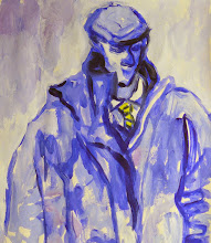
I don’t believe that to be the case. I know when I am happy - I feel light-hearted and expansive. And I know when I am angry - I feel it strongly. I can see it in my face. I can feel it in my head, my heart, my stomach. I can even express those feelings in paint:

“
Angry Auld Man”, 2008.
.....................................................................................
4.00 PAINTERS OF EMOTIONMany artists have spoken of expressing their own emotional states:
Vincent van Gogh:
“
I want to touch people with my art. I want them to say, 'he feels deeply, he feels tenderly”. (4)
Paul Cezanne:
"
An art which isn't based on feeling isn't an art at all ... feeling is the principle, the beginning and the end…” (5)
Georges Braque:
“
Emotion should not be rendered by an excited trembling; it can neither be added on nor be imitated. It is the seed, the work is the flower“. (6)
Pablo Picasso:
“
What I want is that my picture should evoke nothing but emotion“. (7)
Edvard Munch, is probably the foremost painter who we associate with painting his feelings, usually dark and screaming. His poet friend, Sigbjorn Obstfelder wrote in 1893:
“
His use of colour is above all lyrical. He feels colours and reveals his feelings through colours; he does not see them in isolation. He does not just see yellow, red and blue and violet; he sees sorrow and screaming and melancholy and decay” (9)
But it is
Henri Matisse, in his “
An Artists Journal”, who most frequently spoke about painting from his feelings which he described as “
sensations“:
“
The expressive aspect of colours imposes itself on me in a purely instinctive way. To paint an autumn landscape I will not try to remember what colours suit this season, I will be inspired only by the sensation that the season arouses in me: the icy purity of the sour blue sky will express the season just as well as the nuances of foliage. My sensation itself may vary, the autumn may be soft and warm like a continuation of summer, or quite cool with a cold sky and lemon- yellow trees that give a chilly impression and already announce winter”.(9)
and:
“
Composition is the art of arranging in a decorative manner the diverse elements at the painter’s command to express his feelings”.(10)
and:
“…
I simply try to put down colours which render my sensation.”
Matisse had a lot to say about painting his feelings.
Although all of these artists speak eloquently of painting their own emotions they all did so through objectivity - by expressing the emotion through objects or figures.
But it is those painters, who get closer to painting ‘pure’ emotion rather than objectified representations of it that interest me today. Many contemporary artists paint in this way since the idea of doing so was opened up by the American Abstract Expressionists. Mark Rothko being the most recognisable and renowned. He wrote:
“
You might as well get one thing straight. I’m not an abstractionist…I’m not interested in the relationship of color to form or anything else. I’m interested only in expressing basic human emotions - tragedy, ecstasy, doom, and so on. And the fact that a lot of people break down and cry when confronted with my pictures shows that I can communicate these basic human emotions“.(11)
He related this to religious experience: “…the people who weep before my pictures are having the same religious experience I had when I painted them…” (12)
And I won’t argue with that other than preferring to describe the experience as “spiritual” or simply deeply felt from the core of one’s being. It was, after all, Rothko who identified abstraction as “
the expression of the power of the soul“.(13)
In reading about Rothko and looking at his paintings as reproduced in various books,
it left me feeling frustrated that what I was actually looking at probably bore no
resemblance to the real thing and that I couldn‘t get the proper experience of this
painting sitting in my own home. I therefore travelled to London to see the only painting of Rothko’s that was available to me:

“Untilted, 1957.
All object has been distilled out and what is left are rectangular blocks of
thin layered colour speaking intimately of some deeply personal felt experience, not of anger or happiness, but the human condition of tragedy or ecstasy, described
here by the art collector, Ben Heller, in his memoirs:
“
How could he, with such a small number of variations, initiate discussions between picture and viewer as personal, direct and intimate as chamber music? How could he, with these few combinations in a palette of hot and cold, bright and dark, shiny and matte, rapturous and melancholy colors, call forth feelings that recreate the breadth, variety, drama, depth and panorama of the orchestral music he so utterly loved? Who can answer such questions? Only the pictures themselves and each observer.” (14)
And so it was with me. Alone with my thoughts amid a noisy open gallery at the Tate Modern, close enough to see the nuance of colour variation across it’s surface, I felt a deep satisfaction that the journey was worth while. Here was a painting that was brought into existence like warm breath on cold glass, quite unlike any illustration of it in a book. The white and pink horizontal line across it’s width just at my eye-level suggested optimism breaking through like an awakening under a field of dismal dirty yellow.
Contemporary PaintersTwo contemporary painters, who to my mind capture the essence of painting from deep within, are Owanta (15) and Mary Ann Wakeley (16).
Owanta, a French Gabonese living in Paris, paints colourful abstracts based on direct expression of her feelings which she relates to her own brand of spirituality:

“
Blue”, 2008
Patches of bold colour, reminiscent of the more abstract paintings by Nicolas de Stael, she speaks poetically of blue being the colour of the fifth chakra, and expressing personal feelings by communicating with our “inner” selves.
In more subtle mood
Mary Ann Wakeley, a sensitive abstract painter from Philadelphia, USA, also generates her painting from what she describes as a “spiritual” impulse:

“
Inside the Within”, 2007, 30x45cm.
This painting touched me so much I bought it from her. The blushes of dark blues, deep reds, and greens with circles and dots of pure colour like points of stellar energy or oceanic plankton raises in me similar feelings associated with the sea or, my other great love, space. In fact when I first saw it I made an immediate connection to the music of Gustav Holst’s Planet Suite, and Neptune in particular. Although I don’t claim to have Kandinsky’s “Synaesthesia”(17) I feel that I can ‘hear’ the music in this painting.
.....................................................................................
5.00 CONCLUSIONSWith this Extended Written Project it was my intention to explore how it was possible to express my own feelings and emotions in paint by first identifying then raising awareness of them.
In order to develop an understanding of these issues I have sought out and listened to what others have said on the matter - lexicographers, psychologists, ancient Buddhist writers, New Age colour therapists, friends, and other artists, and while much of what I have discovered is greatly fascinating, regardless of what anyone else says, even when spoken with some authority, it is ultimately what I feel and how I can tap into those feelings which counts.
I have come to the conclusion that, while we can analyse scientifically and then try to describe in words where feelings reside in our bodies and what they look like by considering what others have to say about them, neither analysis nor anecdotal evidence is enough. We have to experience them for ourselves for it is my own discoveries that matter most to me as an artist. The basic requirement therefore for me is to simply trust my own intuition and speak from the heart. For what I feel is true.
In practical terms this involves, instead of my usual need for immediate activity, to take some time before a painting session to “tune in” to how I am feeling. I have found that by sitting quietly for a while, allowing the “noise” in my busy mind to briefly and individually arise then let go before turning my attention to the painting subject. In this way, in silence, there is space for the poetry.
And it was in this way that, through Project 4: Painting Feelings and Emotions, I believe I was able to tap into my own inner world and express these feelings in paint:

“Joy”, 2009, oil on board.

“Anxiety”, 2009, oil on board.
The first, “Joy“, received positive and enthusiastic response from many of my friends who correctly identified the intended emotion portrayed as “happy” or “joyful“, but the second, “Anxiety” produced the best response I could have hoped for when one friend gasped in horror saying she couldn’t bear to look at it since it made her feel too uncomfortable! I took that as a compliment.
And with that I finish again with the words of Matisse:
“
My choice of colours does not rest on any scientific theory; it is based on observation, on sensitivity, on felt experiences”.(18)
.....................................................................................
APPENDIX AFrom “The Nature of Emotions” by Robert Plutchik: Advanced Emotions.
Advanced emotion : composed of… : Advanced opposite
Optimism : Anticipation + joy : Disappointment
Love : Joy + Acceptance : Remorse
Submission : Acceptance + Fear : Contempt
Awe : Fear + surprise : Aggressiveness
Disappointment : Surprise + sadness : Optimism
Remorse : Sadness + disgust : Love
Contempt : Disgust + Anger : Submission
Aggressiveness : Anger + Anticipation: Awe
....................................................................................
APPENDIX BFrom “The Nature of Emotions” by Robert Plutchik: Colour Wheel of Emotions and Three Dimensional Circumflex Model.

The cone’s vertical dimension represents intensity, and the circle represents degrees of similarity among emotions. The eight sectors are designed to indicate that there are eight primary emotion dimensions defined by the theory arranged as four pairs of opposites. In the exploded model the emotions in the blank spaces are the primary dyads - emotions that are mixtures of two of the primary emotions.
.....................................................................................
APPENDIX CThe Psychology of Colour as proposed by kaT, www.geocities.com
This is a list of colours and what emotions have been assigned to them by this "Colour Therapist".
I won't list them all, so here is a couple of examples:
Red:
a powerful colour that has always been associated with vitality and ambition. It can help overcome negative thoughts. However, it also is associated with anger.
Orange: a joyous colour which can free and release emotions alleviating feelings of self-pity. It stimulates the mind renewing interest in life; it lifts the spirits being a wonderful anti-depressant.
etc.
....................................................................................
APPENDIX DEastern religions, including Buddhism, speak of “Chakras”, or energy centres along the spine located at major branchings of the human nervous system, and how each part of the body - feet, belly, heart, throat, and head - hold different emotions with specific colours ascribed to them. The heart chakra, for example, has the colour green:

Chakras are considered to be a point or nexus of biophysical energy or prana of the human body. "Prana is the basic component of your subtle body, your energy field, and the entire chakra system...the key to life and source of energy in the universe.
[Susan Shumsky,2003]
The seven primary chakras and associated colours:
Sahasrara : Crown Chakra (Top of the head; 'Soft spot' of a newborn) : violet.
Ajna : Brow or Third Eye Chakra (pineal gland or third eye) : indigo.
Vishuddha : Throat Chakra (throat and neck area) : blue.
Anahata : Heart Chakra (heart area) : green.
Manipura : Solar Plexus Chakra (navel area) : yellow.
Swadhisthana : Sacral Chakra (ovaries/prostate) : orange.
Muladhara : Base or Root Chakra (last bone in spinal cord *coccyx*) : red.
.....................................................................................
REFERENCES
1. The Concise Oxford Dictionary of Current English, 1964 Edition.
2. “Notes of a Painter”, by Henri Matisse, p1.
3. From “The Body”, by Paramanada, p2.
4. Letter from Vincent van Gogh to Theo van Gogh, The Hague, 21 July 1882.
5. Quotes from Paul Cezanne (1839–1906), About.com: Painting.
6. “Pensées et réflexions sur la peinture”, Georges Braque, 10 December 1917.
7. Letters of Pablo Picasso, Boisgeloup, winter 1934.
8. Quote from “Colour in Art”, by John Gage, p83.
9. “Notes of a Painter”, by Henri Matisse, p4.
10. “Notes of a Painter”, by Henri Matisse, p1.
11. From interview with Selden Rodman in “Conversations with Artists“, 1957, NY.
12. From article in The Times, 7 November 1961, under heading “Rothko, Painter of Light.
13. From “Rothko” by Jacob Baal-Teshuva, p50.
14. From an interview of Ben Heller conducted by Paul Cummings for the Archives of American Art, 1973.
15. Owanta.com
16. Mary Ann Wakeley at http://www.flickr.com/photos/maryannwakeley/
17. Synaesthesia, as described by Martin Wenham in his Understanding Art: A Guide for Teachers, is a quasi-medical term applied to “…the stimulation of one sense mode resulting in the stimulation in another“. For example: particular musical instruments would have not merely characteristic sounds but also colours or tastes“. It appears to be the innate ability to “see” certain colours associated with certain shapes, and music, which when painted arouse the same impulses or feelings in the viewer.
18. “Notes of a Painter”, by Henri Matisse, p4.
19. “Notes of a Painter”, by Henri Matisse, p4.
.....................................................................................
BIBLIOGRAPHY AND SOURCES
“The Concise Oxford Dictionary of Current English” edited by HW Fowler and FG Fowler, Fifth Edition, published by Oxford University Press, 1964.
“The Nature of Emotions” by Robert Plutchik, a written article on the electronic encyclopaedia, World Book Millennium 2000 Premier Reference Library published by IBM Multimedia, 1980.
“Colour in Art” by John Gage,
published by Thames & Hudson, 2006.
“The Body” by Paramananda,
published by Windhorse Publications, 2007.
“Rediscovering Emotion” by David Pugmire,
Published by Edinburgh University Press, 1998.
“The Psychology of Colour” by kaT, www.geocities.com (Yahoo)
“Notes of a Painter” by Henri Matisse as published in “La Grande Revue“, 1908, translated by Alfred H. Barr Jr. published under the title “Matisse: His Art and Public, by Museum of Modern Art, NY, 1951.
“Matisse: Master of Colour” by Volkmar Essers, published by Tashen, 2006.
“Edvard Munch: Images of Life and Death” by Ulrich Bischoff, published by Taschen, 2007.
“Edvard Munch Prints” by Peter Black and Magne Bruteig, published by Philip Wilson Publishers Ltd London, 2009, for The Huntarian Museum and Art Gallery, University of Glasgow.
“Mark Rothko: Picture As Drama” by Jacob Baal-Teshuva, published by Taschen, 2003.
“The Artists Reality: Philosophies of Art” by Mark Rothko, published by Yale University Press, 2004.
“Seeing Rothko” edited by Glenn Phillips and Thomas Crow, published by Tate Publishing in association with the Getty Research Institute, 2006.
“Concerning the Spiritual in Art” by Wassily Kandinsky,
published by Tate Publishing, 2006. (First published by R.Piper & Co., Munich, 1912. First English edition published by Constable, London, 1914).
.....................................................................................
ACKNOWLEGEMENTS
This study would have been impossible for me without the input of friends and family.
I would like to thank the following people for giving me their valuable time, patience, and insight in the many discussions on how emotions and feelings might be described in words and what colours they would ascribe to them:
Kathleen, Saranajaya, Ann-Marie, Vairochana, Donnie, and Bob from the Glasgow Buddhist Centre, and most of all, my wife Jacqueline for listening.
I would also like to thank Mary Ann Wakeley, Lee Kaloidis, and Mayako Nakamura for the numerous discussions we had over the internet from which I was able to gather valuable information on this subject.
The Very End.


 There is a bell shape in the top right-hand corner tolling the end of her life, and the planet disc (centre) has clock hands pointing to about five-to-twelve.