Sunday, February 22, 2009

Project 2 : Painting 3 B

Now, I don't know if I am about to do any better than where I got to with my previous posting but I felt I had to try.

What was bothering me was that my two dancers were a bit thin and spindley, and lacking the force and presence of Paintings 1 & 2. So I go back to the sketchbook and give some thought to the overall proportions and how the figures should occupy the space:


I have a feeling that what I need is the figures to fill the space better, and touch the edges. Each window, blue, red and gold, considers various degrees of cropping to determine what is the best format to say what I want about this image.
I decide that something narrower than the full square format is better and start working this up as a Neocolour sketch:


Everytime I do this it reinforces the idea in my head building up a knowledge and feeling that will express itself when the (final) time is right (I hope).

The figures are much chunkier now and more satisfying, but I need to do some more work on an area of difficulty. In the previous attempt I repeatedly came a cropper with the ballerina's head, scraping it off and starting again, and again. This time I make a series of studies solely on this element till I work out how best to tackle it before starting the painting for real. In this way I take the painting of it into myself, like a musician practising his scales before the final performance:


Now I'm ready to get started properly. But my confidence is still a bit low. What I came up against in the previous attempt was in trying to paint directly (as per first two paintings) the lack of established guidance was in fact a hindrence. I didn't instinctively draw/paint the figures correctly and, since I don't want to fall into that trap again, I draw the figures freehand this time in oil pastel before painting:


I am fortunate that my drawing capability doesn't let me down and the figures are just as I want them...more robust and having presence.

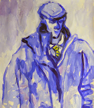
With this drawing in place I set about the painting in much the same manner as before with paint-laden brushes blocking-in the dancers (this time with the knowledge in my head) and then cutting in with the background:


This time I am pleased with the outcome, though perhaps not as excited as my previous two paintings. And rather than a scene from The Sleeping Beauty it looks more like Les Ballets Trocadero de Monte Carlo with a big muscular ballerina!
I still like it as a painting, however, and won't make any more changes.

Painting is a bit of a roller-coaster, and it doesn' work out exacly as one would want every time, but on the whole I am satisfied with the outcome of this painting project and ready to move on to my final painting in this series.

Saturday, February 21, 2009

Project 2 : Painting 3a

This Painting project will be covered in two parts, today and tomorrow, principally due to the 5 image upload limitation, but also because of my dis-satisfaction with where I got to with my first attempt, and my need to try to improve it.

Again, in my pursuit of consistency, I will be describing the same process as before starting by re-drawing the initial sketch to a larger scale and also giving some thought to composition:


Pencil on paper, A4 sketchpad.
I am ambitious to widen the scope of these studies by including more figures but decide to restrain myself and keep it to just two for the present. It's hard enough without trying to do too much for a project designed as a simple introduction to the main fare.

Next stage is to consider values:


Small thumbnails in an A4 pad using felt pen, to which I add some acrylics black, white and grey, and also rollerball pen, both trying to best place the figures.

The idea is formed and this is the design I am going to pursue, so I start thinking here about colour:


Felt pens and Neocolour II on paper, A4 sketchpad.

I hope you understand just how difficult it is for me to remain focussed and not stray away from the Grand Plan in my head!

Here I wander off in a new direction thinking about changing the colouring to warmer mauves and purples which I think will be more "Regal" for Little Miss Sleepy-Head:


Neocolours on paper, A3 sketchpad.

In this study I manage to convince myself that even though there is an awful lot of wide-open space around the figures it is OK since a painting needs quiet areas to offset the busy areas, doesn't it?

At this point I just want to get painting. I think I have done enough studies which, after all, are just continuations of what I did for the first two paintings.

Now, I don't mind showing some of my disasters for all our edification but there is a limit. Suffice to say that the first attempt with the mauves and purples was dreadful! Either my mixing was simply not good enough or when I actually saw it in reality it didn't look right. In any case I decided that if and when these paintings were to be seen together (as at the Assessment for instance) then it would be much better if they looked like a uniform series.

All the paint was scraped off and I started afresh again without any pre-drawing I launch straight in by painting the ballerina with loaded brushes, and then her supporting male dancer, and then cutting in around the figures with the background:


Oils on board, 61x61cm.


All was going swimmingly well and I was definitely enjoying the painting experience, but when I stepped back and looked with a critical eye I knew something was not quite right...something I didn't like.

For the answer to that you will need to come back tomorrow.

ttfn!

Sunday, February 15, 2009

Project 2 ; Painting 2

Since this Project is largely about trying to achieve consistency, the painting and it's process I describe here follows closely with that of my previous painting.

This consistency is something I didn't give too much attention to before, just painting as the mood took me. But now, it is what drives me. I want to be able to produce as high a quality standard as I can with each painting I do, and therefore repetition of approach, materials, colours, and painting style is the way I intend to achieve it.

This first pencil study takes my original sketch (from A6 Sketchbook 1) and increases the scale primarily as an exercise in drawing and loosening the wrist:


Pencil on paper, A4.

Question: Does she fly?
Like a fairy!
It's looking good to me!

OK, so I can draw the figure again and now I am on my way, but before I get too far ahead of myself in this process I need to give some consideration to how it might look with darks and lights, so I make this small Value Study:


Pencil on paper, A4.

I employ the same formula here as before - dark upper background to contrast with the ballerina, and lighter lower background from which she springs.

Following these initial pencil studies I move on to Neocolour pastel studies.
This next photograph shows an A4, and an A3 Colour Study alongside the original sketch in A6 Sketchbook, all clipped onto the workboard adjacent to my easel for reference:


Neocolour pastels on paper, A3 and A4.

The two studies here are very similar because I have a very firm idea as to how this painting will look and I am just reinforcing the concept in my mind. The principal issue I think about is whether to show more of the supporting male dancer. I decide I like the fact that you can hardly see him, just one outstretched hand and his legs. Well, she is supposed to be flying like a fairy un-assisted through the air!

Since I established in the last painting exactly the way in which I was going to paint this next one I go straight to a fresh board and, having mixed the colours I intend to use, get started by painting the ballerina with large paint-loaded brushes, without any preliminary drawing:


Oils on board, 36.5x61xm.

This is where I come a little unstuck. On my first pass at this I am unhappy with the colour of the ballerina's upper legs - they are painted far too strongly a bright orange. So I scrape it off and cool it down with a light green to describe the shadow under her tutu. But I'm still not happy with this element, as well as the length of her trailing arm, and her poor hand. Rather than scrape off again I challenge myself to paint the whole thing once more, just to see if I can do it:


Oils on board, 36.5x61cm.

This is better. The differences may be subtle butfor me more satisfying - I have got better colouring on the ballerina's upper legs and have shortened her trailing arm to a better proportion, and also painted the hands of both figures much more satisfactorily.

To finish with I am very happy I have managed to paint a second painting in as close a manner to the first making them a fine pair to be shown together.

I need to keep this momentum going.

Sunday, February 8, 2009

Project 2: Painting 1

As described previously (in "Project 2", below) this first painting project will not only reprise where I have got to with my painting for the benefit of the OCA who haven't seen any of this work, but try to push it forward into a more settled, definite style which is repeatable.
Over the past few years I have managed to create a wide range of paintings, often in various painting styles, but more specifically an expressive painting style of my own mostly using painting knife rather than brushes. This, however, has I feel been at the expense of developing real quality. Accepting the discipline of this Course is intended to not only establish a consistent way of painting but to raise the quality of my output.

With "consistency" as my watchword I decided that this would apply to everything I do, and so for this first painting project I will be creating a new series of paintings on the theme of 'Dance' and in particular, working from the sketches I made from Scottish Ballet's "Sleeping Beauty", of ballet dancers.

To start with I choose one sketch (male dancer lifting ballerina) and work this up to a larger scale making pencil studies of the two figures in an A4 sketchpad. Rather than making meticulous copies I try to be loose and expressive since if I don't get some energy into it here then as I proceed it will begin to tighten up.

From there I then move up in scale again with Neocolour studies, firstly in an A3 sketchpad, then onto A2 cartridge paper. This first photo shows three studies set up beside my easel for me to work from:


The uploading restrictions of Blogger prevent me from showing all the studies I made but suffice to say that none of the later studies were any better than this Neocolour in the A3 Sketchpad:


Moving on to my first attempt at painting I fall back to the same way I have been painting for a while, namely thick impasto with painting knife over a previous "failed" painting:


I have been very comfortable with this style of painting and got what I considered good results, however, it struck me after I had finished this that it depended too much on having old paintings of the correct dimensions to hand, and being able to identify the "happy accidents" where previous colours showed through. I felt this was unsustainable and so tried another approach:


This was painted in accordance with the manner described by Dan McCaw in his book "A Proven Strategy for Creating Great Art". I have had this book for many years and have utilised some of his process but never quite followed it through to completion. This time I do as he suggests and make a light pencil drawing of my design on a clean white-primed board before laying in flat colours, starting from darks/shadows through to lightest areas, then working over the whole painting with thick partially mixed paint with large brushes.
This, as you can see, works quite well - I am pleased with the colouring and although the male dancer is a bit stiff the ballerina "floats", but my problem with it is that it depends heavily on making a well proportioned drawing on the painting board, and it also feels a bit like "Painting By Numbers" where you are just filling in the shapes.

I decide that this is all a bit too laborious for me and I need something more direct. I know that my comfort zone is drawing and feel that what I need to develop is the same comfort with painting. So why not just paint directly onto the board? This is what I do here:


This for me is the best yet. It is strong, direct, and dynamic. I am very satisfied with this painting, and while it needs a lot more development I will attempt to repeat this way of painting next week.